
Microsoft Surface Studio review: Creativity is a sublime, pricey experience
 Image: Adam Murray / IDG
At a Glance
Expert’s Rating
Pros
A simply gorgeous 4.5K touchscreenMicrosoft’s optional Surface Dial significantly improves the experienceEliminates separate drawing tablet by letting you ink on the display
Cons
Placing all expansion ports on the rear of the base is inconvenientMassive display reflects quite a bit of lightA premium experience with a premium price attached
Our Verdict
Microsoft’s Surface Studio is an artist’s workstation for digital content creation, featuring a massive touchscreen that conveniently pivots down into an easel mode. Inconvenient port placement and mediocre components may cause you to consider other options, though.
Best Prices Today: Surface Studio
RetailerPrice
We’ve never seen anything quite like the Surface Studio. No other all-in-one boasts a massive 28-inch 4.5K touchscreen that glides down to serve as a digital easel, a Surface Pen for inking, and an optional Surface Dial that you can spin and tap to navigate menus. Presto! You’re a digital creator.
We applaud this refreshing example of what a PC could be, and we’ll talk a lot about the new things it can do for you in this review. But we also expect the Studio to be more than just an aspirational machine that can cost hundreds or thousands of dollars more than its competition. In real life, it still needs to be a productivity PC, a decent gaming platform, and the embodiment of the Windows 10 Creators Update. We’ll take a close look at these fundamentals, too.
A luxury-class All-in-One
A typical PC buyer has a budget, then seeks out a PC that includes the most powerful components they can afford. That’s the wrong approach for someone considering the Surface Studio, where the components take a backseat to the overall design. If you plugged the price and specs into a spreadsheet, it’d look like a tough sell.
I can safely say, however, that the $4,199 Surface Studio Microsoft loaned to us is one of the nicest PCs I’ve ever used. It doesn’t matter that the book-sized chassis packs mobile—not desktop—components: a 2.7GHz Intel Core i7-6820HQ and Nvidia’s GeForce GTX 980M 4GB GPU, plus a whopping 32GB of memory, a massive 2TB hard drive, and a 128GB SSD for caching. Wireless connectivity is supplied by 802.11ac Wi-Fi and Bluetooth 4.0, and two Dolby Audio Premium speakers hide beneath the Studio’s display.
I may grumble that Microsoft banishes every expansion slot to the rear of the machine. In reality, sliding your fingers over the 28-inch, 4,500×3,000 (3:2) PixelSense display evokes the same intangible, deep satisfaction of sinking into the rich leather of a luxury automobile.
 Adam Murray / IDG
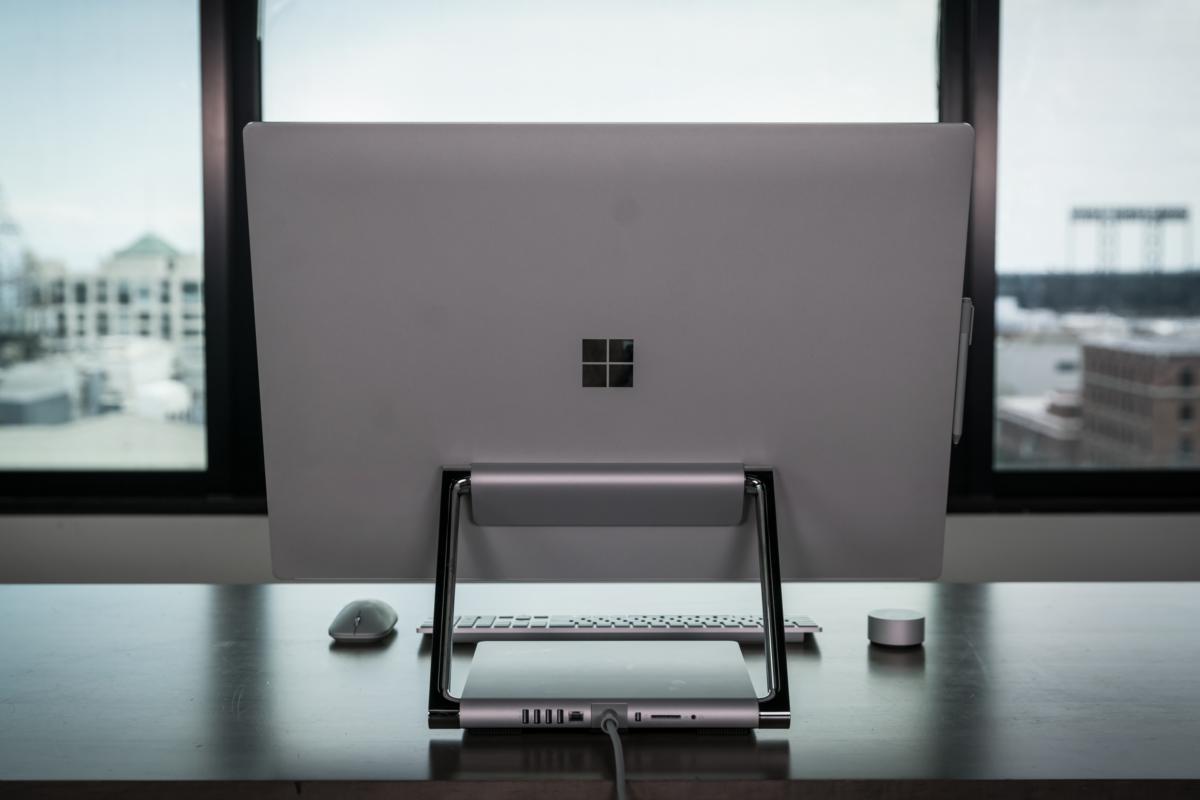
When its display is positioned in a conventional, upright position, the Surface Studio requires very little desk space.
Interacting with the Surface Studio’s display is an exquisite visual experience. Simply placing the monitor a few inches away from your eyes lends urgency to whatever you’re doing: inking a scene, watching a 4K movie on Netflix, working on several documents simultaneously, or playing a game. It’s an IMAX screen for your desk, commanding your attention.
Unlike the Surface Pro 4 or even the Surface Book, the size of the Surface Studio’s display allows windows to be snapped to all four corners without feeling like they’ve been shoehorned in. Is it large enough to replace a second monitor? Absolutely. I’m still in the camp that says you’ll always want a second monitor, though, especially if you’re using the Surface Studio as a full-screen workstation (remember Task View). The Surface Studio includes the same miniDisplayPort connector built into other members of the Surface family if you decide to expand.
 Adam Murray / IDG
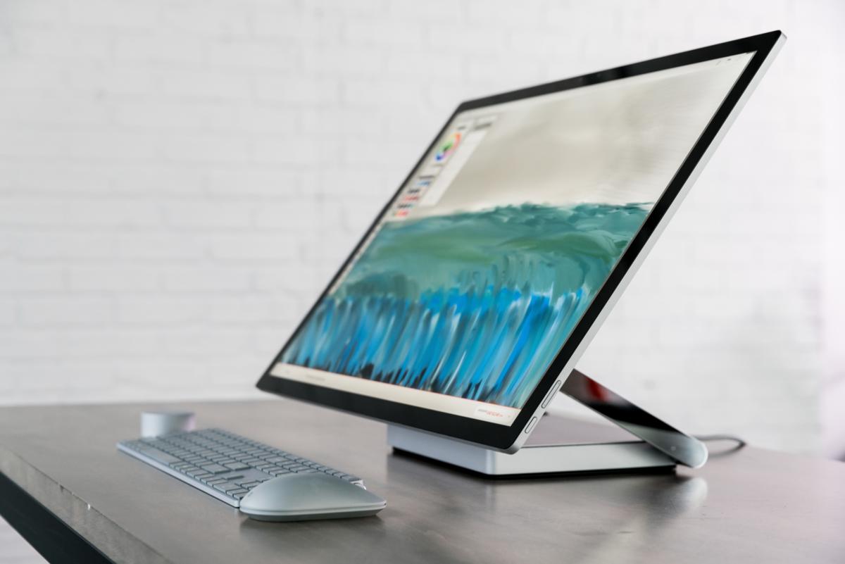
Color explodes from the Surface Studio’s display.
Most monitors, however, don’t offer the vibrant color that the Surface Studio does. Unlike other Surface devices, a Surface Studio owner has the option of configuring the display for the traditional sRGB color space, DCI-P3 (developed by the film industry and probably preferable for watching digital video), and the default Vivid setting. By our measurements, the Studio blasts out a maximum of 410 lumens of light. The Studio’s somewhat drab default background doesn’t do it justice, so open Bing or the Windows 10 Creators Update’s custom backgrounds, and your monitor will blossom into rich color.
If there’s any disadvantage to the Surface Studio display, it’s that the glossy screen tends to capture and reflect light, whether it’s sunlight or simply the ambient light of a room. I sometimes had to adjust the screen’s angle to minimize glare.
Like other Surface devices, the Surface Studio includes Windows Hello capabilities using a front-mounted 5MP camera, which delivers 1080p video, or works with Skype or other applications. (Some other AIOs hide the camera when not in use; the Surface Studio does not.)
 ADAM MURRAY / IDG
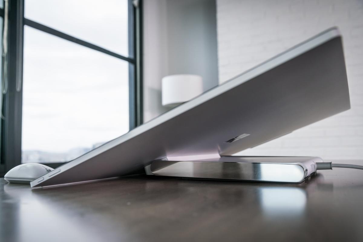
The Surface Studio, fully reclined.
A completely new angle on productivity
You don’t just look at the Surface Studio’s gorgeous display, of course. You work on it, too. With just a gentle tug, the Studio’s thin (0.41-inch) display arcs downward on a chrome-plated “zero-gravity hinge.” At its lowest angle (about 20 degrees, with the bottom edge flush with your desk) it requires 16 inches of desk space from front to back. Even if you only adjust it sparingly, that’s still quite a footprint. (The Studio doesn’t offer the height adjustments of other high-resolution monitors.)
Using the display’s touch capabilities was seamless. I never gave the Surface’s palm rejection much thought: I simply grasped the Studio’s included Surface Pen and began inking. I rested my arm on it, my wrist, my hand. It just worked. As with other Surface displays, the Studio supports 10-point multitouch, though I doubt most most users will do more with it than pinch and zoom.
Using the Surface Studio at its fullest incline provoked a small debate about whether it actually was ergonomic to use in that position. My editor noted that a traditional writing desk is angled. None of the staffers who used the Surface Studio this way experienced any discomfort.
 DELL
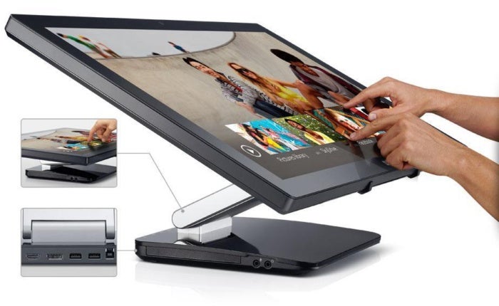
DELL Dell’s now discontinued s2340t monitor looks a lot like a Surface Studio. Hey, monitor makers: could the Studio usher in the return of articulated displays?
The ability to adjust the display is clearly one of the selling points of the Surface Studio. While the design isn’t entirely unique (Dell’s s2340t monitor above, looks similar), Microsoft’s implementation is extremely strong and sturdy. The Surface Studio never overturned even at the display’s most extreme angles, a bit of mechanical magic that I’m sure many will overlook. We relocated the Studio around the office on several occasions, carrying it by the hinge. It felt rock-solid.
You’ll love the Surface Dial
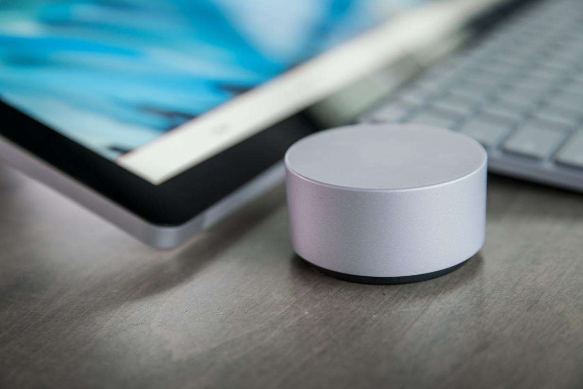
The Surface Dial is the Surface Studio’s most innovative accessory. Some Mac users might consider it Microsoft’s $100 version of the Griffin PowerMate Bluetooth control knob, an accessory which debuted about four years ago as a wired controller for the Mac. (Griffin has no plans for Windows 10 support anytime soon, according to a company spokeswoman.)
 ADAM MURRAY / IDG
The Surface Dial works both on and off your desk.
Just as you don’t need a mouse, or a touchscreen, or a stylus, you don’t have to buy the Dial. But in a surprising number of scenarios the Dial shines. Weighing a sturdy 0.3 pounds, with a diameter of 2.32 inches, the Dial’s just a bit smaller than an actual NHL hockey puck. The base may sit on your desk or the Surface’s glass. Pressing and holding the Dial brings up a radial menu, which you navigate by spinning and tapping the Dial.
The Dial has a special pad on its base that gives it a little traction on the display, no matter what the angle. Left alone onscreen, however, it will slowly slip downward. It functions identically on a traditional work surface, and several users in the office simply sat it next to the mouse.
You can use the Dial as a generic Windows navigation accessory to scroll, zoom in, go back and more. It’s surprisingly handy for web browsing. You can also configure extra key inputs into the Dial, which serve the same function as keyboard shortcuts.
 MARK HACHMAN / IDG
In Windows proper, the Dial’s abilities are fairly limited. Note the “custom tool” icon to the far right, however, which you can custom-configure.
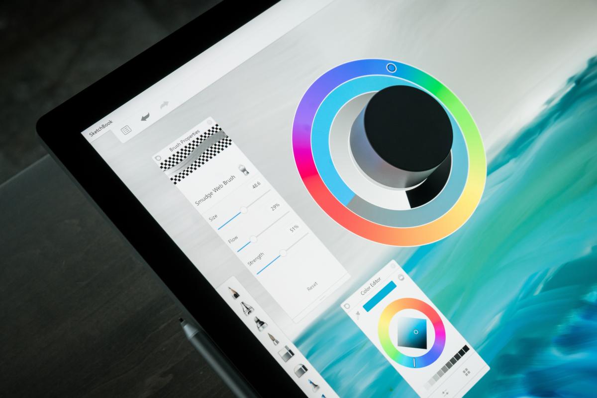
App developers can write in support for the Dial. I kept coming back to Autodesk Sketchbook, one of the apps that turned the Dial into a color wheel, with three rings for hue, saturation, and luminance. A tap moved between each ring.
I have to be honest, though: When drawing, using the Dial was sometimes less effective than simply tapping the color I wanted using an app’s own color pickers and the Surface Pen. In that case, using the Dial felt like choosing an Etch-a-Sketch over a mouse.
 ADAM MURRAY / IDG
Within a drawing app, however, the Dial becomes significantly more powerful.
Where form betrays function
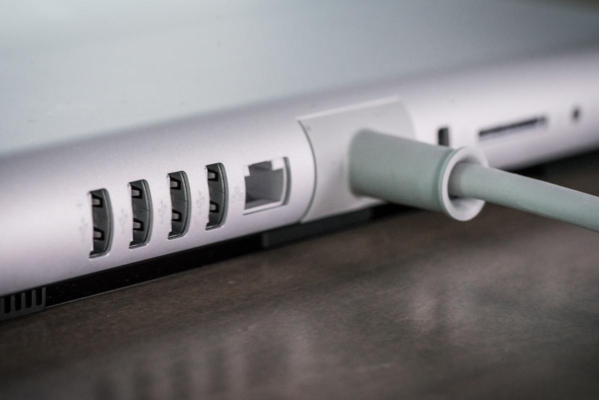
I can’t knock the Studio for much, but it definitely sacrifices convenience for aesthetics. Every expansion port—four USB 3.0 ports, a full-size SD card reader, Gigabit Ethernet and the miniDP port—is relegated to the back of the base. If your work surface backs up to a wall or cubicle partition, you could end up turning the whole contraption around for something as simple as plugging in a USB drive.
 ADAM MURRAY / IDG
Every port on the Surface Studio is, annoyingly, on the back of the base.
The Surface tablets manage to put both the headphone jack and a USB port on the side of a small tablet; the Surface Studio, with over a foot of vertical space along the side of the display, does not. Somewhere, Apple’s Phil Schiller must be stroking his own headphone jack-less iPhone and quietly chuckling. Courage!
I was initially turned off by the Surface Studio’s wireless mouse and keyboard. Oddly enough, the keyboard’s keys are slightly smaller than the Surface Book’s (0.609 inches versus 0.627 inches). Microsoft also reorganized the top row of function keys and added a second Windows key at the bottom. I never felt hindered while using the Surface Studio keyboard, but my fingers felt more comfortable on the Surface Book. Ditto for the mouse: It felt generic and a bit out of place with a $4,000 machine, but served its purpose.
 ADAM MURRAY / IDG
The Surface Studio’s mouse and keyboard are a little smaller than I’d like, though otherwise comfortable.
A solid performer with mobile parts
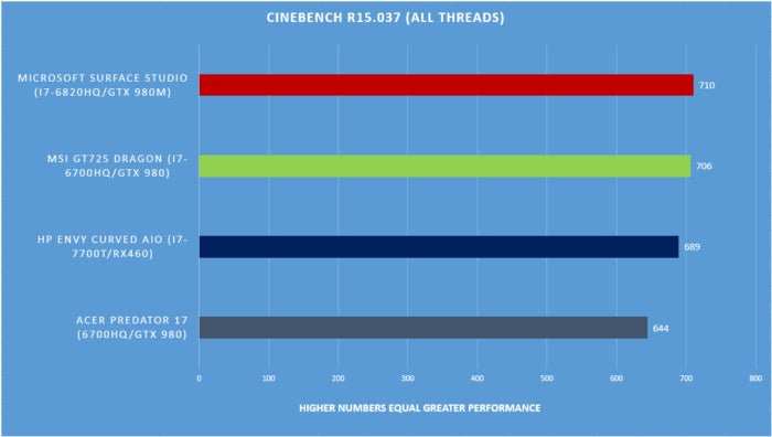
For all the Surface Studio’s external distinctions, inside it’s just a collection of the same components you’ll find in other all-in-ones and gaming notebooks. For performance testing we chose to compare it to another recent AIO, HP’s $2100 Envy Curved All-in-One 34 (2017), as well as several gaming laptops based on similar mobile quad-core CPUs and a range of GPUs.
We decided to exclude Microsoft’s Surface Book. While we enjoyed the concept of a Surface-to-Surface comparison, the dual-core 6th-gen Skylake Core i7-6600U found in last fall’s Performance Base update lagged far behind the other systems in our sample.
Of the benchmarks we typically run, the most significant measure of the Surface Studio’s performance is probably Cinebench, a benchmark authored by Maxon that’s based on Cinema 4D. Because Cinema 4D is an actual 3D content creation tool (used in movies like The Life of Pi), Cinebench comes closest to an actual use case. The multi-threaded version of the test focuses on the CPU, favoring more cores and more threads. The Surface Studio slightly leads a close pack in this test.
 Mark Hachman / IDG
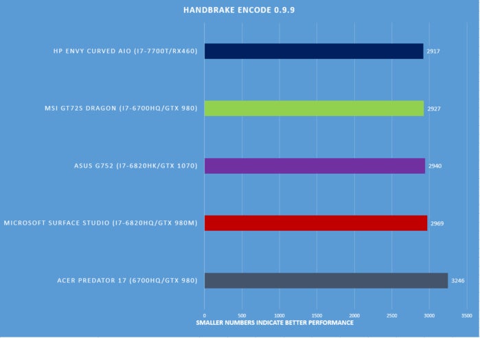
While video editing may not be what the Surface Studio was designed for, Handbrake’s video transcoding text separates CPUs with more cores from those with less. In this case, because the systems’ CPUs are all quad-core (either mobile or desktop), they scored very closely.
 Mark Hachman / IDG
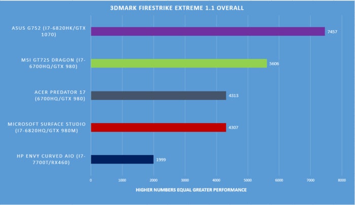
If you’re looking strictly at performance numbers, you may have wondered why you should choose a Surface Studio instead of the cheaper HP Envy Curved All-in-One 34. The answer, in part, lies within the FireStrike Extreme synthetic game benchmark, where the Surface Studio’s GeForce GTX 980M leaves the HP’s RX 460 in the dust. To check that in real-world applications, we also ran Tomb Raider‘s built-in benchmark on both systems. The Surface Studio more than doubled HP’s performance, 77 frames per second to 33.8 fps.
 Mark Hachman / IDG
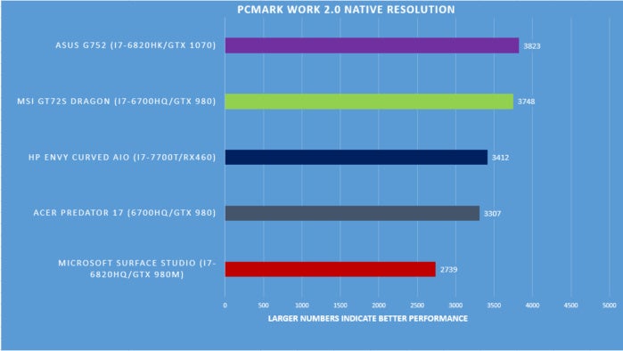
After the strong performances in other tests, the Surface Studio lagged in the more productivity-oriented PCMark tests. Given that its CPU and GPU perform comparably to peers with the same hardware in benchmarks that isolate each of those parts, we suspect that the Studio’s 4.5K-resolution screen may be affecting performance in PCMark 8. It never felt slow or laggy while using it, and we don’t expect it to perform worse during everyday tasks like email and web browsing, nor in applications like Photoshop. (The Surface Studio does, after all, have the benefit of its 980M to help it during creative work.)
 Mark Hachman / IDG
 Mark Hachman / IDG
 Mark Hachman / IDG
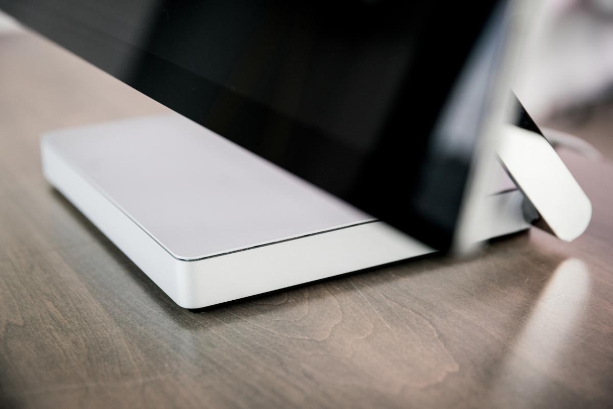
While the Surface Studio’s performance over all is very good, I can’t help but think about the compromises built into its compact base. Mounting mobile components right behind the display makes sense in something like the Asus Zen AiO Pro, where cooling is a priority. HP went the same route with its previous Envy Curved (the 34-A010). By moving the components into a larger base with this year’s Envy, HP was able to fit in performance-boosting desktop components. The Surface Studio could have followed that lead or better still, emulated the Zotac Zbox E-Series Magnus, whose taller base fits a full-fledged Nvidia GTX 1070 graphics card built in for extra graphics power.
I don’t consider the mobile parts to be a flaw, or even something that could be improved upon. It’s a design decision that I disagree with. To the Surface Studio’s credit, though, it was incredibly quiet. While I’d opt for more power, Microsoft’s choice of mobile components may have prioritized the sanctity of the creative process.
 Adam Murray / IDG
If Microsoft wanted to expand the Surface Studio base a bit to provide more horsepower, it wouldn’t destroy the aesthetics.
The intangible power of the Surface Studio
Many reviews you’ll read of the Surface Studio—including this one—are somewhat clinical. Benchmarks don’t full describe the Surface Studio’s appeal.
What the Surface Studio does, though, as a whole, is maximize your potential. It focuses you. I’m no artist—you can certainly tell that from the illustrations. But one night, after everyone else had gone home I spent an hour or two with Autodesk Sketchbook. I didn’t need to stay. My dinner was waiting, and my stomach was already growling. But I felt that pull gamers say they feel: just one more turn.
With the Surface Pen in hand, I sketched out a region, added contours with a digital pencil, painted a surface color, then blended it using Sketchbook’s smudge brush. I’d tap the Dial, zoom in. Tap and hold, twist, bring up the color wheel. Over and over. It wasn’t just the Dial or the Surface Pen or the touchscreen or the angle or the palm recognition—it was all of them, working cohesively, just as a car’s wheels, pedals, gears, and mirrors shepherd you from point A to point B. I’m no artist, and yet I created something I’m proud of. In that moment, I understood the Surface Studio.
Both the Microsoft Surface Studio’s vast, glorious sheet of glass and its hip Surface Dial accessory embody Microsoft’s great contribution to PC design: a declaration that the hardware itself means as much or more than what’s inside of it. But the Surface line has broken trail for the rest of the PC industry, too, as a number of tablets have followed the lead of the Surface Pro 4 and its older siblings. Let’s hope this happens again.
Microsoft has delivered an elite creative experience with the Surface Studio. Now I’m looking forward to the next step. Here’s hoping that Asus, Dell, HP, and others take Microsoft’s example and begin designing Surface Studios the rest of us can afford.
Best Prices Today: Surface Studio
RetailerPrice