
Pitch Deck Teardown: Queerie's $300K pre-seed deck
Queerie is a dating app aimed specifically at LGBTQIA+ folks. It’s a very early-stage company that’s raising just $300,000 — a round size that typically falls into the “friends and family” category.
Dating is a fiercely competitive space, and there’s been a fair amount of M&A activity over the years, so I was eager to take a closer look.
We’re looking for more unique pitch decks to tear down, so if you want to submit your own, here’s how you can do that.
Slides in this deck
Queerie shared its full, unredacted, 13-slide pitch deck with TechCrunch.
Cover slideCover slide part 2Mission slideProblem slideSolution slideMarket size slideHow it works slideTraction slideCompetition slide Team slide Ask and Use of Funds slide 6-year (!) financials Contact slide
A couple of things to love about Queerie’s pitch deck
The first thing that struck me about Queerie’s deck is that it feels fresh and fun. The use of language and graphics is clean, simple and engaging. A great starting point for a consumer brand!
Lead with the mission
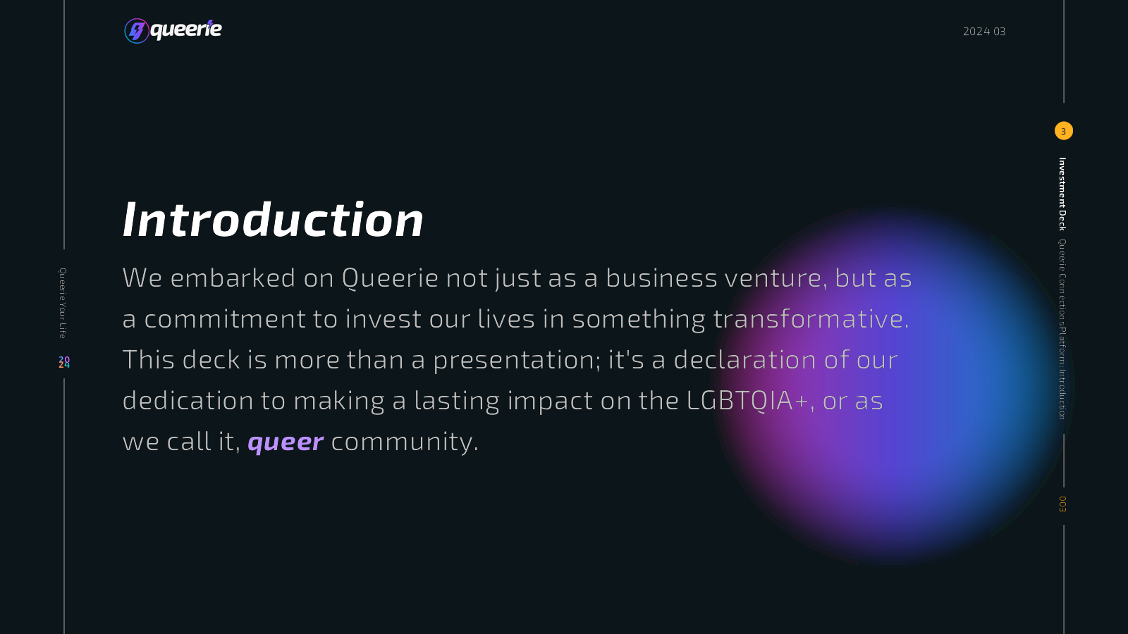
If you’re trying to make the world a better place, you’re probably going to attract mission-aligned investors. So why not spell out your mission front and center? It’s a powerful storytelling technique that’s well executed in the Queerie deck.
Talk about a hard-hitting problem
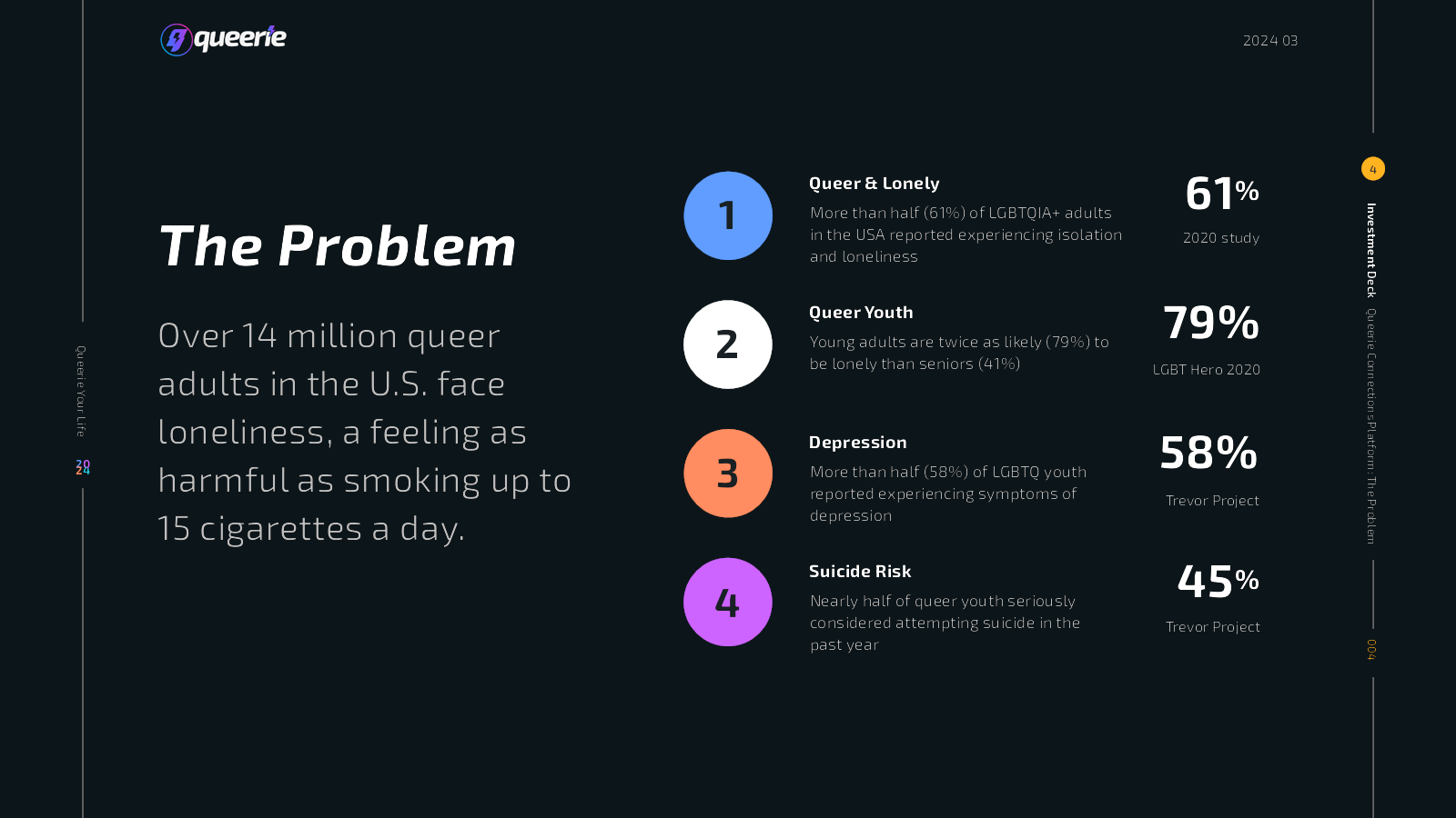
This problem slide gave me pause: It stood as a reminder that in a lot of places, isolation and mental health challenges are rife in queer spaces.
The company is positioning itself less as a dating app and more as a solution for loneliness. Whether investors will buy it and whether this app is the right solution to the problems the company identifies are separate questions. What is certain, however, is that the problem Queerie outlines is one worth solving.
Four things that Queerie could have improved
I really want Queerie to exist, so it pains me to see that the way the company is pitching makes it essentially unfundable.
Is this the right team?
I see at least one dating app pitched every month, which makes sense: Dating and finding the right partner(s) is an important part of many people’s lives, and it seems like such an easy thing to do better than what’s currently out there. The upshot is that many of these startups have founders with a lot of experience in the dating world.
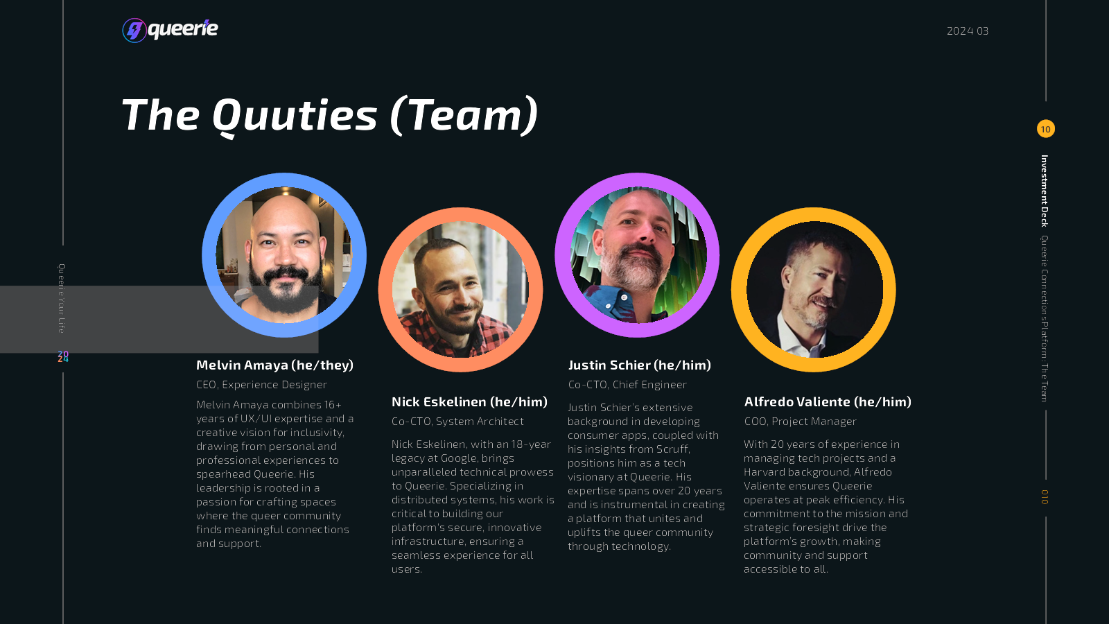
But where are the women? For a company that’s building an “inclusivity-designed platform,” that seems like a bit of an oversight.
There’s some interesting experience here, but most of the people seem almost too senior for this startup. I know that’s a rare thing to complain about, but one of the CTOs has been a site reliability engineer at Google for 18 years. That’s a very specialized job, and while scaling an app like Queerie is going to be important, I’m finding myself doubting how much overlap there is between scaling Google’s infrastructure and scaling a site like Queerie.
Overall, from reading the team’s LinkedIn profiles and what’s on this slide, I find myself concluding that they might be able to build a really good, well-functioning app with a great user experience — but that isn’t enough to build a successful company. There is a huge gap on the sales and marketing side, and there’s not a lot of startup experience across the team either. If this slide could add a seasoned marketeer with consumer marketing app experience, I think the team would be more believable right out of the gate.
This is just describing a dating app
I really don’t understand what this slide is trying to accomplish:
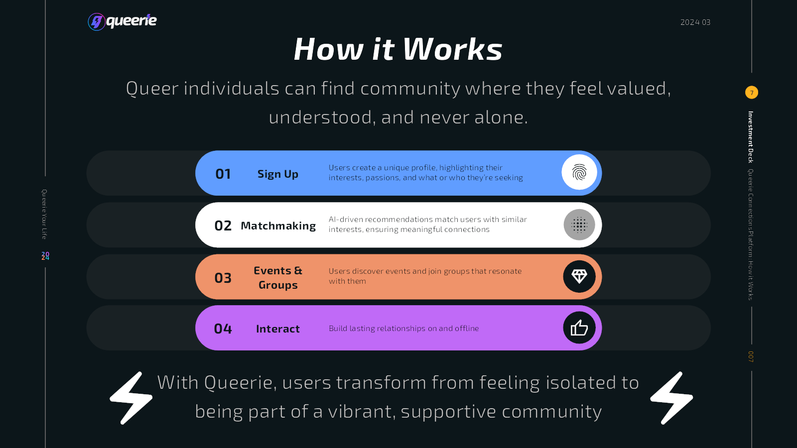
This slide is a bit of a waste. It doesn’t show any of the secret sauce for why Queerie is going to be successful where others have failed; there’s nothing new or innovative here.
Slides in a pitch deck should help an investor decide to invest. If someone reads the slide and it’s likely to be neutral (or even negative), it’s best left out.
That’s not traction
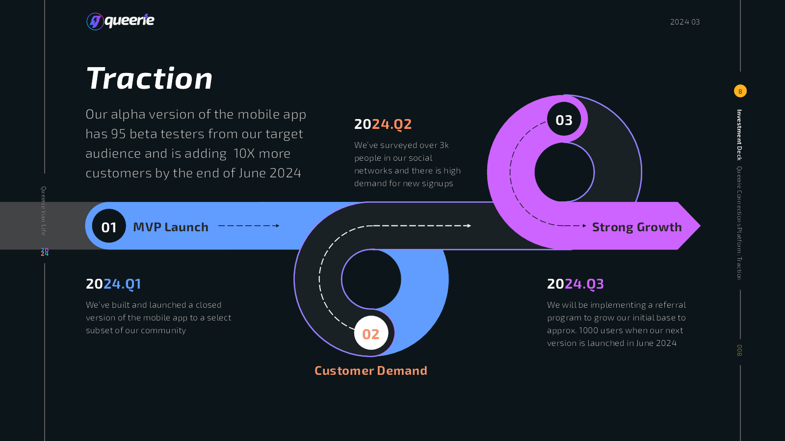
The company says it has a “closed version of the mobile app,” but this 13-slide deck doesn’t include a single screenshot of the app. The company says it has 95 beta testers, which is great, but that isn’t really “traction.” Traction would be how these beta testers are interacting with the platform. Are they paying? What are the DAU/MAU (daily/monthly active users) stats?
I’m writing this on March 31, which is the last day of Q1 2024, so I’m confused why the company says it surveyed 3,000 people in Q2 of 2024? The company also says it is planning to grow the initial user base with “strong growth” in Q3, but then says it is launching the app in June, which is in Q2. This isn’t a huge deal, but it is a little confusing.
Fundamentally not venture scale
This slide, which describes how quickly the company wants to grow, raises some red flags.
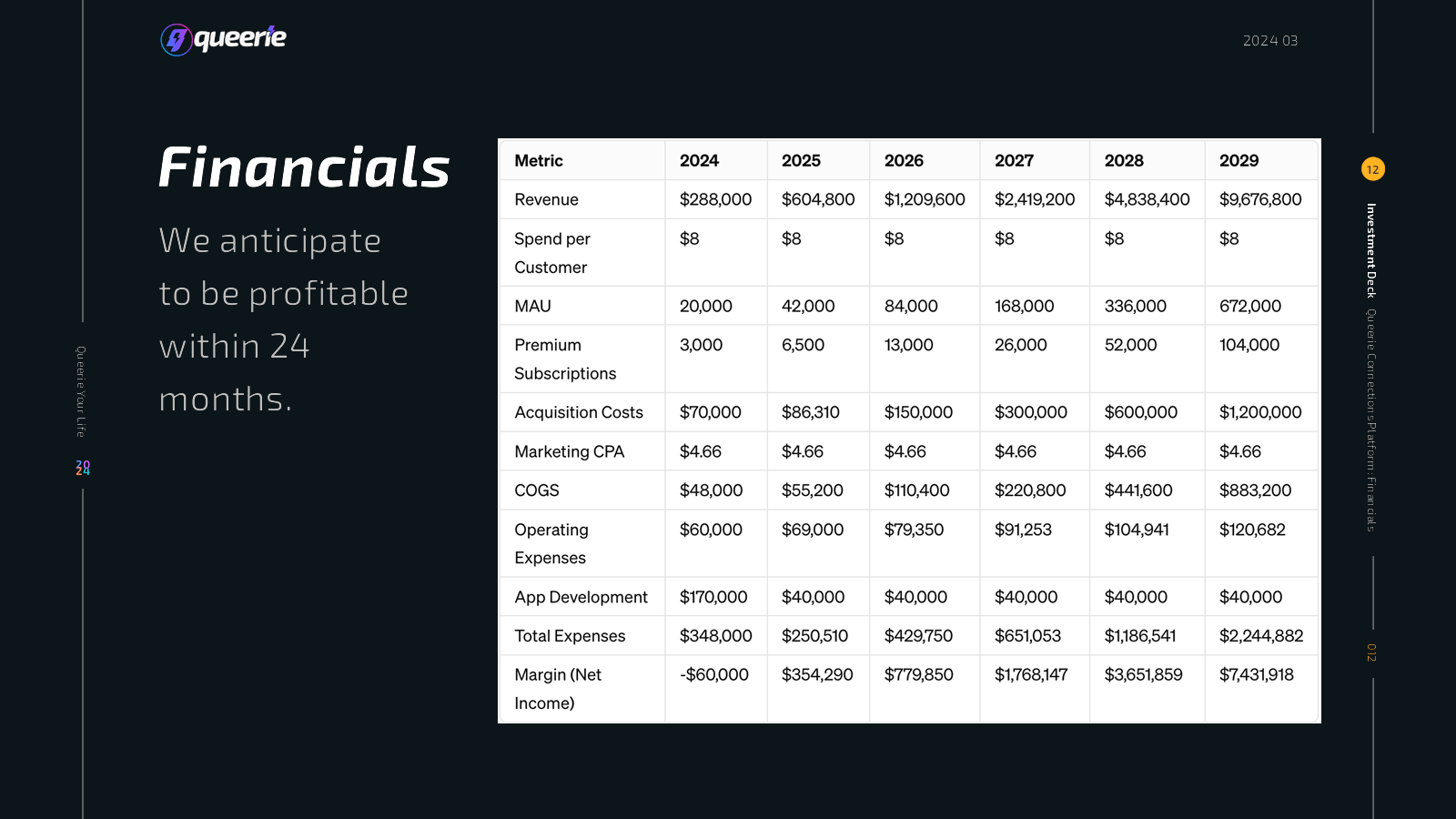
After the first year, the company is only planning to spend $40,000 per year on app development. That doesn’t even get a half-decent part-time developer. For a company that’s a tech startup, that’s a terrifying oversight: Is the company not planning to continue to develop its apps?
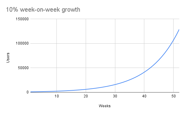
The growth here is way, way too slow. Elsewhere in the deck the company says it will acquire 1,000 users in the first half of 2024, but then it’s going to hit 20,000 monthly active users by the end of the year. Then suddenly the growth drops to “merely” doubling in 2025, and doubling again in 2026. For a hypergrowth early-stage startup, those numbers are awful. Startups typically want to be growing 10% week-over-week in the early stages. If you start with 1,000 users, after a year of 10% week-on-week growth, you should be at around 130,000 users:
Even worse, however, with the current six-year financials, Queerie is planning to do just under $10 million of revenue in 2029. That’s pretty dismal and indicates that the founders don’t have a particularly aggressive growth plan in place. Its own numbers show that it only expects about 15% of its customers to be paying $8 per month.
Elsewhere in the deck, the company says, “Our mobile app will allow us to expand to more cities as we raise more capital,” which is awesome, but the financial overview doesn’t show more fundraising happening in the business, so it’s unclear when or how much the company is planning to raise.
In a nutshell, this slide shows that Queerie could be a pretty successful lifestyle business, but I fear that no investors would go anywhere near this as an investment; it’s too unambitious, and it shows that the company’s founders don’t understand what is expected of them as startup founders.
The full pitch deck
If you want your own pitch deck teardown featured on TechCrunch, here’s more information. Also, check out all our Pitch Deck Teardowns all collected in one handy place for you!