Sample Series A extension pitch deck: Doola's $1m deck

The world is full of businesses that try to help streamline the process of setting up a company. Doola is one such startup, and it has raised a cool $12 million to date since its inception in 2020. The company just closed a $1 million “strategic investment round” from HubSpot Ventures, less than a year after its $8 million Series A, and today we get to take a good look at the pitch deck it used to raise that round.
Usually, when a startup raises a small amount of money following a decent-sized round, there’s something strange going on — it’s a symptom of something not quite going to plan. In Doola’s case, however, HubSpot’s involvement makes sense: The marketing software company reaches a lot of customers, so Doola’s toolset could be a good fit with HubSpot’s business model.
Doola nurses new capital for its ‘business in a box’ tool targeting global founders
We’re looking for more unique pitch decks to tear down, so if you want to submit your own, here’s how you can do that.
Slides in this deck
Doola shared its 14-slide deck without any redactions.
Cover slideFunding timeline slideProblem slideSolution slideProduct slideStrategy slideProduct portfolio slideMarket size slideHow it works slide U.S. market opportunity slide Global market opportunity slide Vision slide Team slide (?) Contact slide
Three things to love
To be frank, I can tell from just looking at the list above that there’s a lot of information missing from the deck. In fact, my AI deck-review tool estimates there’s only a 15% chance of Doola successfully raising capital with this deck alone. We’ll get to that later, but let’s first focus on what Doola got right, because it does do some things incredibly well:
Great use of a combination slide
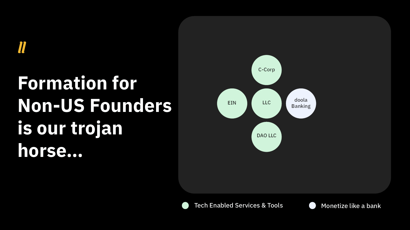
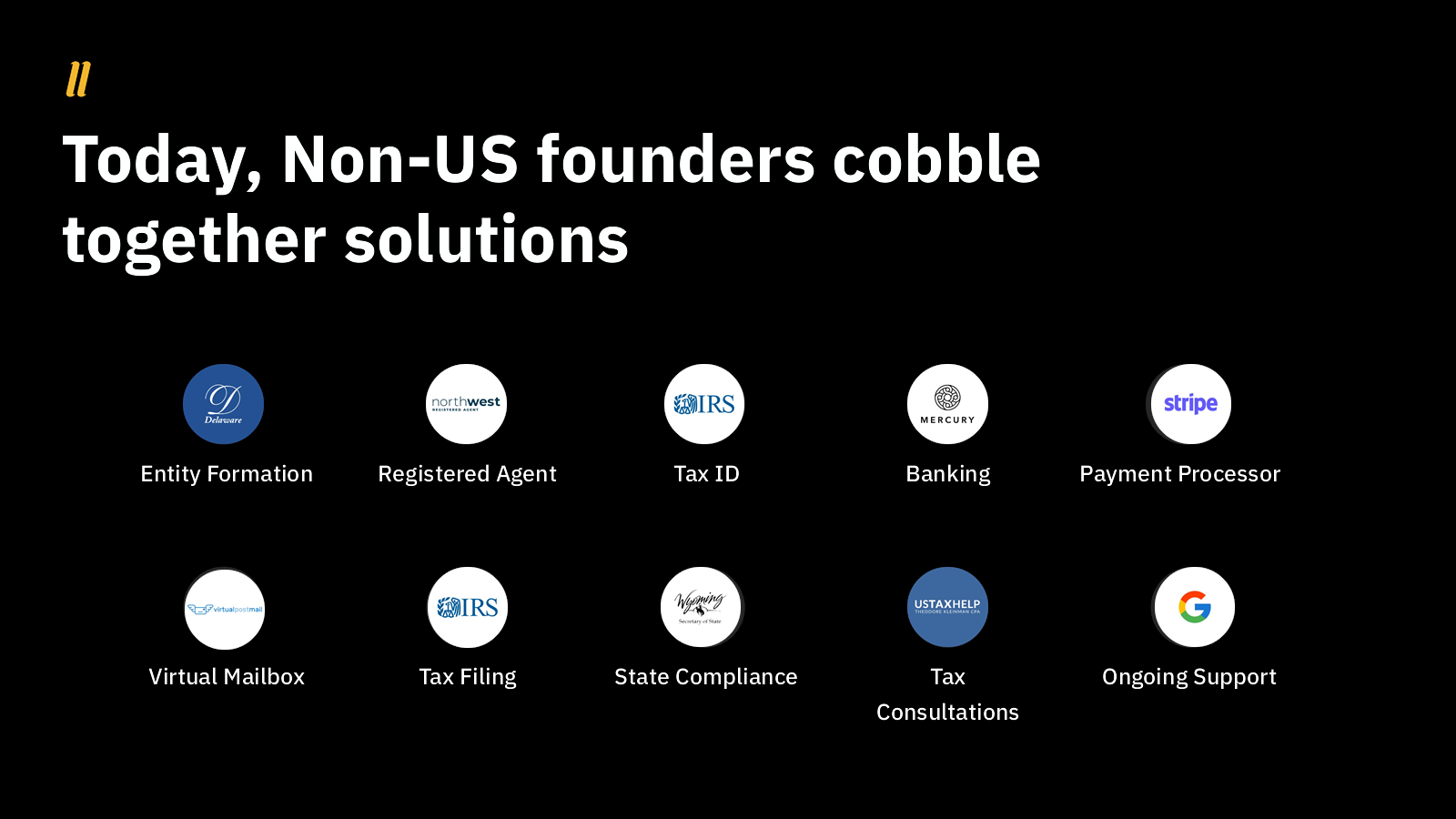
I love using two slides that work together to tell a compelling story. Doola uses slides 6 and 7 to great effect:


This is quite the effective way to build toward explaining the business model indirectly. It also sets the stage for explaining the business model and monetization plans over time.
A subtle and elegant problem statement
This is a perfect example of a company that knows its audience. The slide lays out a bunch of problems, but Doola knows it is talking to investors, and so it resists the temptation to explain each problem. Investors are painfully aware of many of these issues and how they show up for startups.

Simplifying things is always a gamble, but in this case, I believe Doola won the bet. Yes, these are complex, frustrating and expensive problems, which makes them definitely worth solving!
Interesting bottom-up approach to size up the market

Most startups have a decent amount of success with the top-down approach for estimating their market’s size (using the TAM/SAM/SOM model). But it’s interesting to see Doola take a different tack to arrive at a potential market size of $4.5 billion per year. As I’ve written before, great founders often have to turn to a bottom-up approach to market sizing, because there’s nothing else like what they are building out there.
I’m not sure if that’s the right approach here given that this space does have a few competitors, but I do enjoy the clarity of this slide.
As I mentioned earlier, there’s a vast amount of information missing from this pitch deck. So much, in fact, that it is essentially useless as a traditional pitch deck. I suspect that Doola was already talking to HubSpot Ventures as part of its original round and that something encouraged HubSpot to write a check anyway — maybe the investor had already made up their mind before they saw this deck.
In the rest of this teardown, we’ll look at three things Doola could have improved or done differently, along with its full pitch deck!
Three things that could be improved
The stuff that works in this deck does an amazing job, but . . .
Where’s the rest of the deck?
As a founder, you’re not going to get away with using a deck like this unless something unusual is afoot. There’s so much missing here that this post will be 900 pages long if I explain it all, so let’s condense it to bullets:
No real discussion of the product: No screenshots of what the company has built, and it isn’t clear how much of the product actually exists.No description of the competitive landscape. That’s a mistake. Typing “company formation” into Google gets you pages on pages of potential competitors. Stripe, Atlas, ZenBusiness, LegalZoom, Tailor Brands, IncFile, IncAuthority, and oodles of others. The company hints at how it is different (caters to international founders) but doesn’t explain why its target audience couldn’t use the competitors, or how it is different.No go-to-market plan. Who are the customers, and how will the company reach them? No idea.No mention of traction. I’ll go over that in more detail in a few short moments.No operating plan. Here’s why you need one.No ask. How much are you raising?!No use of funds. You raise funds to do something. Spell it out!No business model (CAC/LTV etc.).No clear description of the target customer.No mention of a pricing model.No clearly spelled out value proposition.No explanation of the unit economics. How does this company work at scale?No moat or explanation why this company is defendable.
That is wild, given how good the slides in the deck are.
Here’s a handy checklist of the 16 slides you need:
That 30-slide deck won’t cut it anymore
This team slide is useless

I have no idea what’s going on here. Why would an investor need to know the U.S. population compared to the rest of the world? Why would they want to know that you have employees in Russia, Israel and Japan? Perhaps the founders are making a point when they talk over this slide, but on its own, this slide has me baffled.
The team slide is often considered the most important slide in a startup’s pitch deck. If your startup has extraordinary founder-market fit, this slide should be one of the first in your presentation. The fact that this is the penultimate slide and doesn’t say anything about the team is a huge red flag.
I wish Doola had instead focused on its key team members. It’s not necessary to include everyone, but at least mention the people whose roles are central to the startup’s success. Detail their backgrounds and talk about their relevant experience, skills and any unique qualifications that make them ideally suited for their roles. Illustrate how the founders’ skills, experience and vision align with the market’s needs and opportunities the startup is addressing. Explain why this team is not just qualified, but uniquely qualified to execute on the specific opportunity your startup is pursuing. This can include their industry expertise, previous entrepreneurial successes, or specialized knowledge relevant to your startup’s field.
The team slide is your chance to showcase the human capital behind your startup, which is often as important to investors as the idea or product itself.
Where’s your traction?
I wanted to highlight the absence of a traction slide specifically.
It’s absolutely crucial to talk about your company’s traction so far in a pitch deck. That’s true for all pitches (even if you don’t have revenue yet), but especially for a startup like Doola that is this far into its journey. When investors see that your product or service has gained some level of acceptance in the market, it validates the demand for what you’re offering.
This is especially important for early-stage startups, where the product-market fit might still be in question. Traction shows that not only is there demand for your product, but also that you are capable of capturing and growing this demand.
What to do about your traction slide when you don’t have revenue yet
Traction is also a key indicator of potential success — it suggests that your business model is working and can be scaled. Metrics such as user growth rate, revenue growth, partnerships secured, or any other key performance indicators relevant to your business can clearly illustrate this potential.
Moreover, traction highlights the effectiveness of your team. It’s one thing to have a great idea or a brilliant product, but effectively bringing it to market and generating interest or sales is quite a different proposition. Demonstrating traction shows that your team has developed a viable product or service and that it possesses the competence to execute your business plan effectively. This is key, because investors are not simply investing in your idea; they’re also betting on your team’s ability to execute it.
This lack of traction metrics combined with the fact that the company is raising what looks like an extension round makes for a red flag of epic proportions. If I were considering investing in this company, the founders could expect to be thoroughly grilled about the company’s business model, product, customer acquisition and traction metrics.
The full pitch deck
If you want your own pitch deck teardown featured on TC+, here’s more information. Also, check out all our Pitch Deck Teardowns and other pitching advice, all collected in one handy place for you!